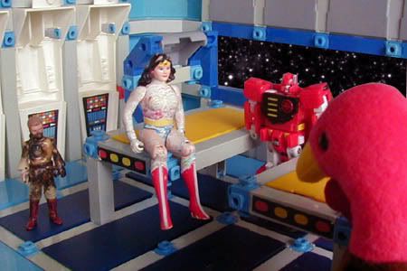

Designing a set is very different than designing a toy or playset. While I'm normally looking to make my designs as complex as possible and to never waste space, sets need to be simple and spacious so that the characters can move freely within them and not be upstaged by the setting.
The two sets shown below (main bridge and medical bay) were both designed to have four fully detailed sides. Each side is rigged on swinging joints so that, after carefully disconnecting a few beams, any wall could swing down to the ground, allowing me to move into the space with a camera. It's regrettable that I used these sets for such a small span of time and captured so little of them on camera. They had a lot of potential.
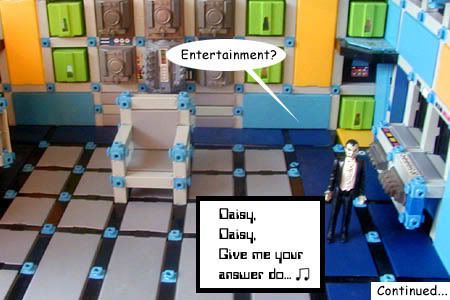
The main bridge, with a command chair, a science station to the right, and a transporter in the far corner.
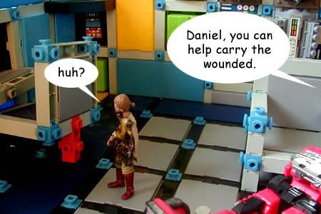
The left side of the bridge, complete with tactical station and chair, and another transporter in the far corner.
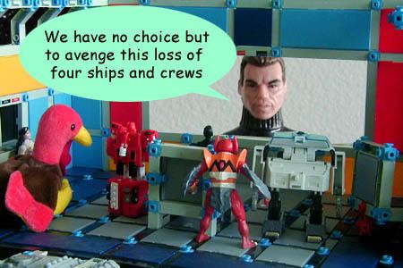
The front viewscreen (with an obviously photoshopped image onscreen). You can barely see the ceiling here, as well as the moonlighting windows up above with "space" outside them. The rear wall is also barely visible in the foreground of this image, swung down to the floor so that I could move in with the camera.
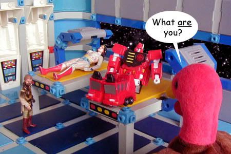
The medical bay, complete with two medical beds (each with an adjustable scanner hanging over the beds). The "space" outside the window has been photoshopped in.